Do users understand how to navigate the catalogues and find content of interest?
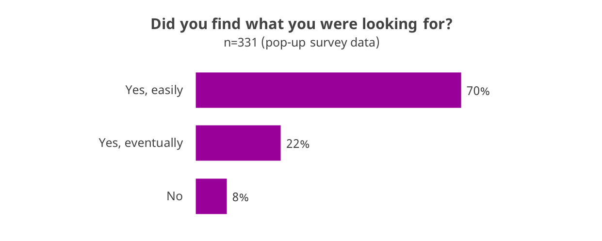
Our study found that participants using these catalogues typically can find what they are looking for and with relative ease, but that there is also room for improvement. Seventy percent of pop-up survey respondents said they easily found what they needed in the catalogues, and another 22% found what they were seeking with more effort. Only 8% of respondents said they couldn’t find what they needed.
Unfortunately, those individuals who failed in their search didn’t often leave feedback on what they had been seeking, but the few who did (n=11) were generally looking for artworks they had seen in the past but did not know the title of.
The catalogues’ layout and navigation also received fairly positive ratings at the end of the email survey, with no significant differences between the four catalogues.
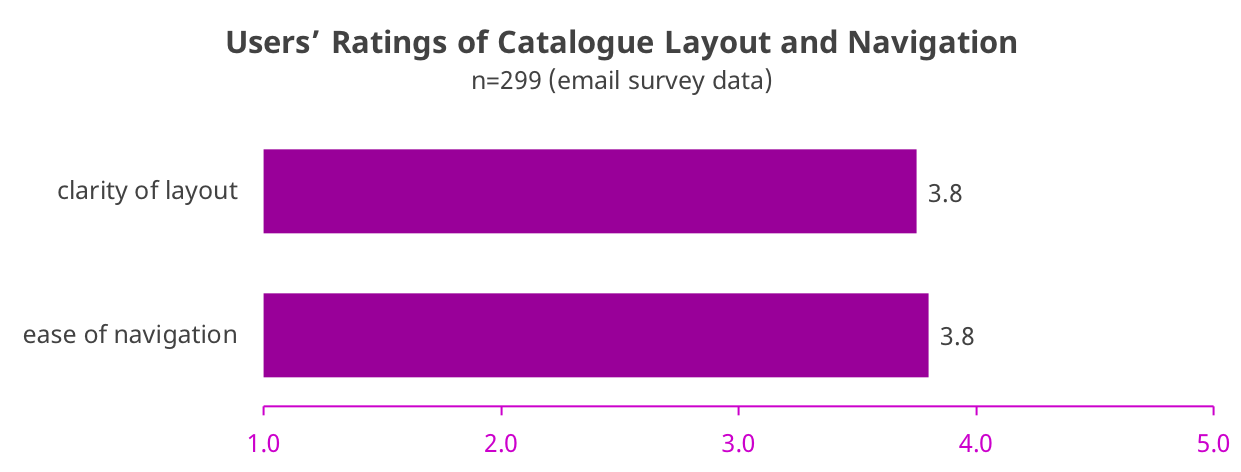
The fact that all four catalogues received similar scores for clarity of layout and ease of navigation suggests that although individuals might have varying preferences, on the whole users can adapt to quite different formats. (For individual catalogue scores, see Appendix A: Further Analyses — Catalogue Layout and Navigation Scores.)
When asked to comment on the catalogues’ structure and navigation, several themes emerged from the responses of our focus group participants:
Book-like navigation can feel constricting in a web environment
The AIC’s Matisse catalogue gives users two options for navigation: 1) turning the catalogue page by page using arrow buttons, and 2) a Table of Contents sidebar that can be collapsed or expanded. Some participants relied on the arrows to turn the pages, which became cumbersome and didn’t give the readers a sense of where they were within the catalogue. The analytics data also shows evidence of this, in that pages earlier in the catalogue are receiving higher amounts of traffic. (See a list of top pages viewed under Appendix A: Further Analyses — Top Pages Viewed.) Even when readers were aware of the Table of Contents, they couldn’t shake the feeling that the catalogue was imposing a linear direction on their reading:
I felt like there was no opportunity for me to explore the publication as I wanted as a reader. Instead, I felt pushed into selecting the side arrows to move sequentially and progressively through the publication. For me, this feels contrary to what the digital format should be.
I think what struck me…as I was sort of doing the homework was how much I value the flexibility of how I want to move through these publications. And that with the Matisse one in particular, I felt right away, very constricted that I sort of had to move in the way that they directed me in this sequential progressive way.
This sentiment arose several times in the focus group discussions. Overall, participants expressed the desire to jump from place to place as their interest dictates and felt the layout of the Matisse catalogue hindered this.
Keep navigation tools obvious and well-labeled
Focus group participants generally seemed to prefer that the catalogues use more labels, even if it means occasionally sacrificing clean design. Not everyone noticed the “breadcrumb” provided in the NGA catalogue for navigating back to the homepage. Those who found it appreciated it, and those who did not complained about having to use the back arrow on their browsers.
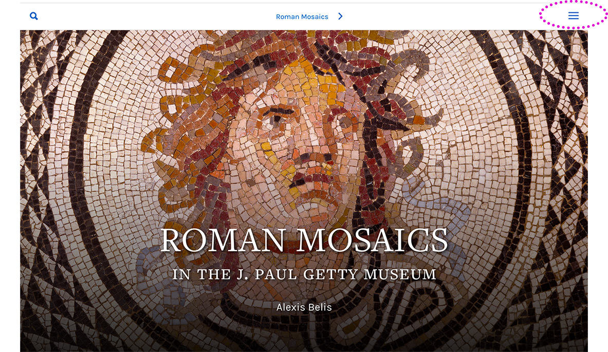
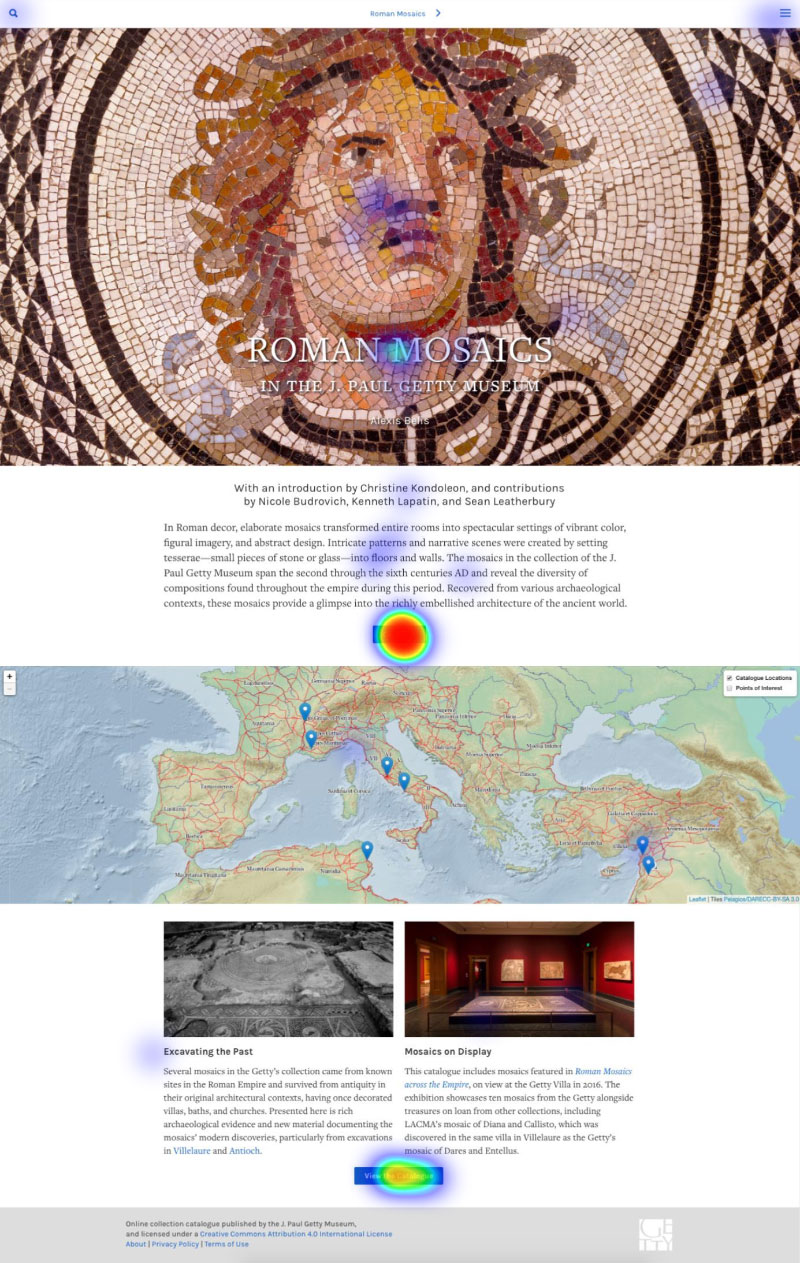
Likewise, the “hamburger menu” (three small horizontal lines) that leads users to the “Contents” page of the Roman Mosaics catalogue was too discreet for the taste of many users.
Precise navigation is appreciated
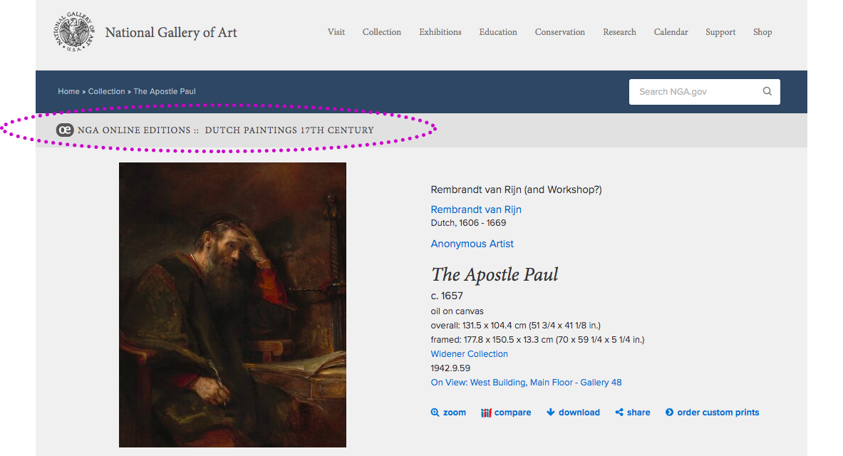
When users want to navigate back to where they were in a publication, they want to be able to return to the precise spot on the page. This is an advantage of the NGA’s Dutch Paintings catalogue, as pointed out by one focus group participant. The back button on users’ browsers returns them to the same spot on the page they had been viewing previously, rather than returning them to the top of the page, in which case users would have to scroll down to find their place.
Homepage design can have a big influence on navigation
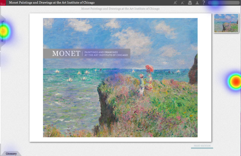
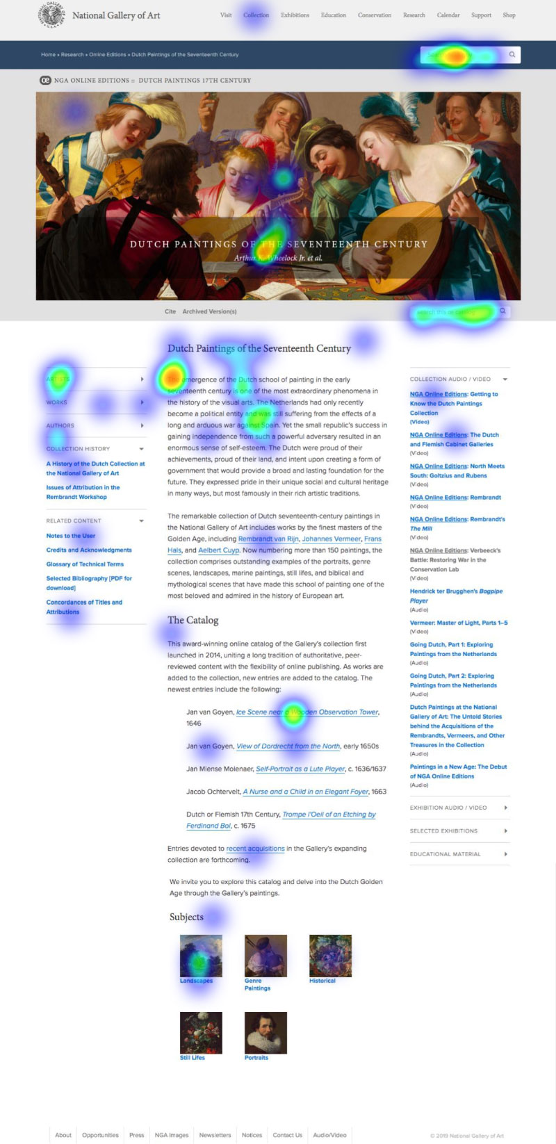
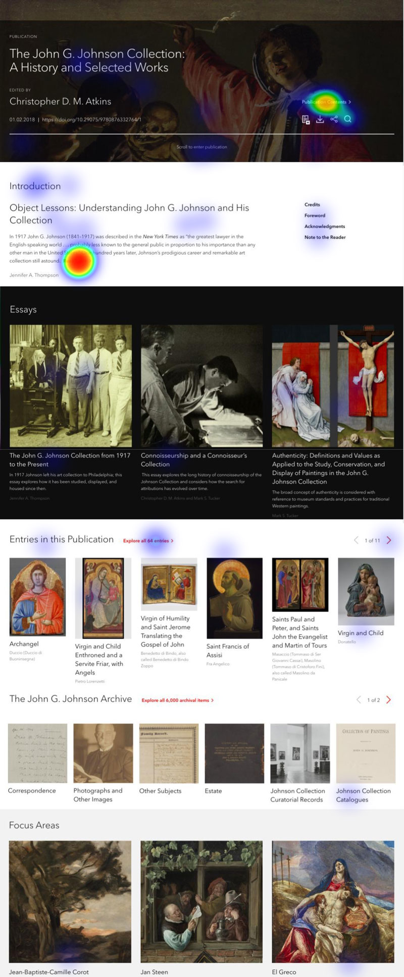
Email survey participants were asked what they would look for first when visiting a digital catalogue and where they would click to find it, and the resulting heatmaps are telling. The clean design of the Monet catalogue homepage means that visitors will be funneled in a limited number of directions. The Getty’s page is longer, but still has limited entry points via bold, obvious buttons. The NGA’s homepage has many links to lead users into the catalogue without a suggested hierarchy, and the heatmap shows that users are likely to click any number of places. The PMA’s homepage is the longest and also has many potential entry points, but users are drawn most to the “Read More” button highlighted in red text, which will lead them into an introductory essay on the collection. A smaller percentage of users selected the “Publication Contents” link, which is less noticeable in black and white. Catalogue designers can therefore influence whether users will begin browsing a digital catalogue from the “front,” refer quickly to a contents page, or dive directly into artwork entries and essays based on the layout of the homepage. Each may have pros and cons for the user experience, but designers must consider how to help users quickly get their bearings if they suddenly find themselves deep in content and seeking a way back.
Paths between digital catalogues and their parent museum websites are useful and must be clearly marked
Our study participants appreciated when each art museum provided links between digital catalogue content and additional content on the host institutions’ webpages, but these connections were also occasionally a source of confusion. The Getty, NGA, and PMA catalogues all provide links between the catalogue and their museums’ collection pages. In the Getty and PMA catalogues, the collection pages open in a new tab on the user’s browser. In the NGA catalogue, artwork entry pages are one and the same with the museum’s collection pages. For all three of these catalogues, users had some difficulty distinguishing when they were within the catalogue and when they had left. If they knew they had left, they weren’t always certain how to get back to the catalogue content:
One issue I found with some of them was when they did link to the larger collection, it sort of just dropped you into their main website and you couldn’t find your way back.
Allowing easy passage between collection pages and the catalogues, however, is one way to drive additional traffic to the catalogues. Researchers investigating an object might be unaware of a catalogue’s existence until they are linked to it through a museum’s collection pages. Maintaining these connections but also clearly demarcating the boundaries of collection/catalogue is therefore a challenge for the catalogues. Ensuring that links between the two open in new tabs may be one way to signal to users when they have left one resource and entered another.
(For further discussion of how the NGA’s catalogue structure affects the visitor experience and catalogue traffic, see Appendix A: Further Analyses — The Unique Structure of the NGA’s Online Editions.)