What are users’ first impressions of the catalogues?
First impressions are important in a web environment, where users often scan a page briefly and make a decision about its usefulness in a matter of seconds. The four digital catalogues reviewed in the email survey have distinct designs, and one of the first questions for participants was if first glimpses of the catalogues’ homepages clearly conveyed the type of resource they were viewing. A strong majority of participants described the catalogues as “scholarly/academic resources” and “educational resources.”
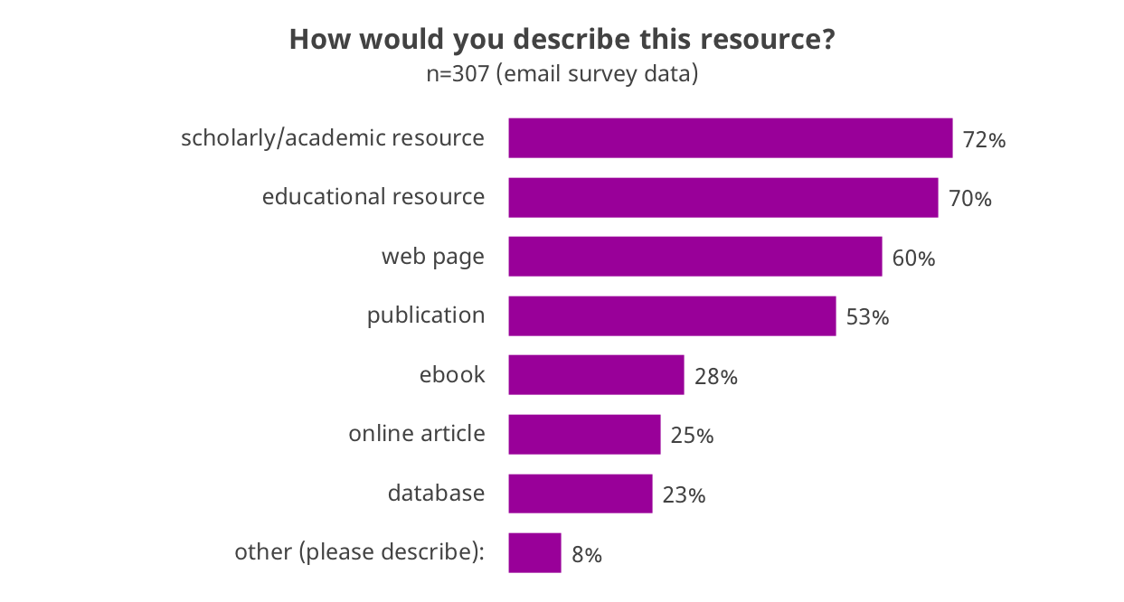
At first glance, participants were more likely to describe the catalogues as “web pages” than “publications,” which may say something about the perceived formality of these resources.
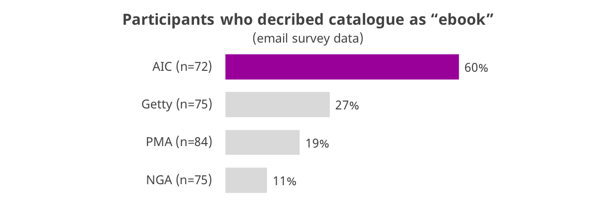
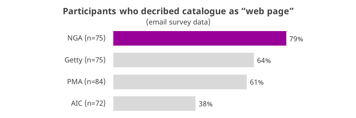
The AIC’s Matisse catalogue is intentionally designed to resemble a book, and participants were therefore more likely to describe it as an “ebook” in their survey responses. The NGA’s catalogue, in contrast, was more likely than the others to be described as a “web page.” Both of these findings align with focus group responses. Participants talked about the Matisse catalogue resembling a more static resource, similar to a book. Several also described the NGA homepage as “old school web” with its three-column layout and the large amount of information packed into the homepage.